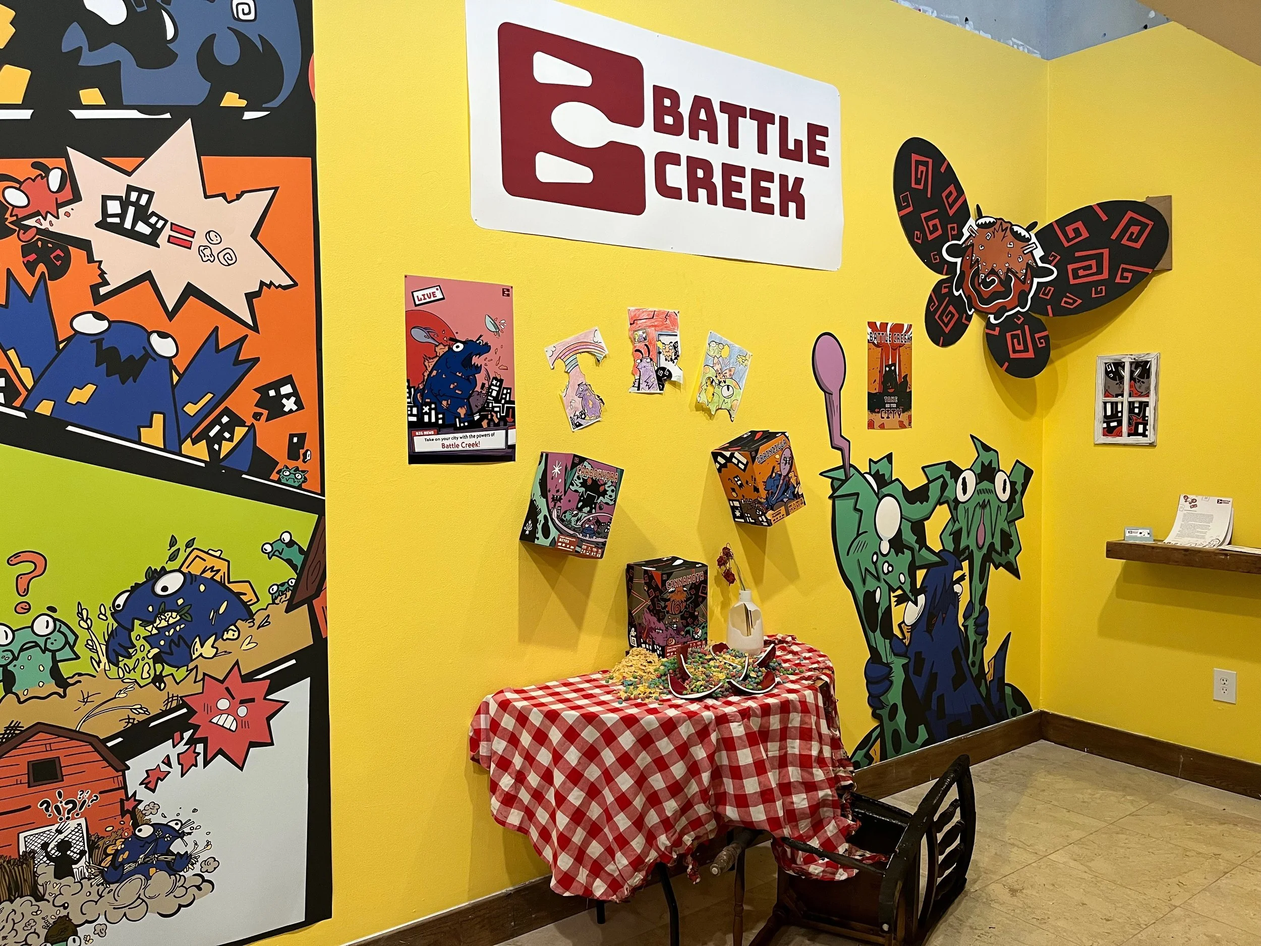
Battle Creek
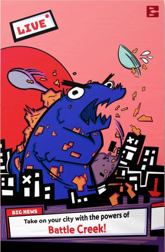
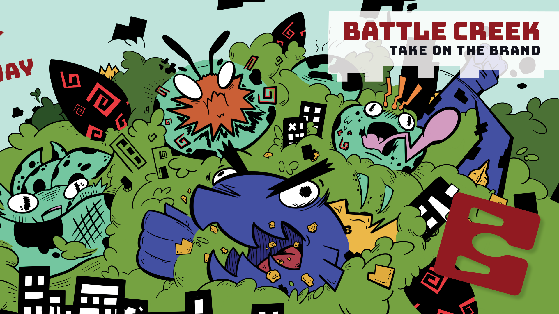
Battle Creek is a cereal company that brings in-your-face monster combat and a world of cereal to the breakfast table. Using sugary rage to entice the viewer and connect them to the feeling they would get by consuming this cereal. The power to go toe-to-toe with the tough parts of your day! Grainzilla’s super strength, Cinnamoth’s pyrokinesis, and Carbohydra’s chilling bite could all be yours. So grab a bowl, a plate, a fistful, however you want. Take on the city!

This is a year-long project for my senior thesis at Florida Southern College where I was tasked with creating and directing my own brand. With that, also came presenting my thesis to the the students and faculty within the art department in a manner that fit the themes of the brand.

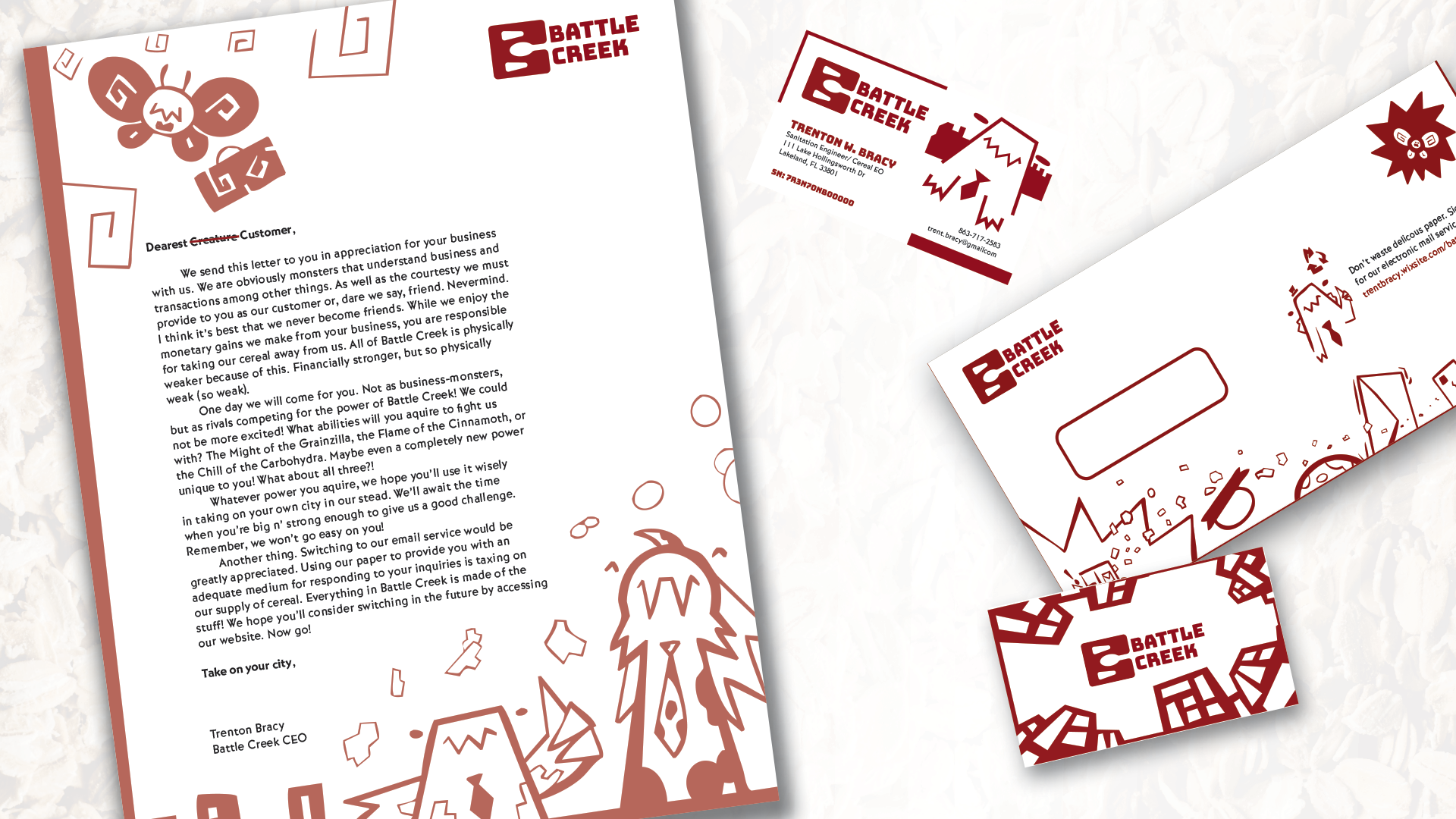
The logo is a monogram that lulls into a false sense of security before bearing its fangs! Making a “B” before carving out a “C” using its spoon. The logo itself was designed to have its own monstrous personality. More timid than the other denizens of the city, disguised as a logo, it hides in plain sight from far larger monsters.
The typeface is Bungee. Thick and heavy. Reflecting the weight these monsters are throwing around in the city. An appearance that’s reminiscent of text found in monster movie posters that have solid lines and flat bases. The body texts sleight unevenness also adds an element of playfulness to the atmosphere that relieves any intense sensations.
The fauna of Battle Creek use vibrant colors to stand out against the chaos of combat. Each box has its own color schemes each monster takes on when they appear on the covers. Intense cartoon action unfolds as the cereal empowers these monsters with various abilities. Prying open the mouth of this box reveals the source of their powers. It’s also 7 1/2 inches on all sides to give it a sturdy foundation.